USDFC
Client
Secured Finance / Filecoin Foundation
Role
Product Design
Duration
Dec 2024 - Ongoing
Overview
USDFC is the first stablecoin built on the Filecoin network, created by Secured Finance. They created an app based on Liquity that enables users to lock FIL as collateral in order to mint USDFC. It also offers a stability pool for protocol participants to help maintain solvency and earn rewards.
To support its early development, UXIT (User Experience Improvement Team) at the Filecoin Foundation conducted a dogfooding session, stress-testing the product’s usability and documenting major issues, blockers, and areas of confusion. The findings were then organized and shared with the Secured Finance team through a report, and revealed the need for a full V2 redesign: not to change the core features, but to significantly improve the app’s look and feel, explain core concepts, and guide people through complex flows more effectively.
Problem
Our dogfooding session revealed that while the core functionality of USDFC was in place, the app presented significant usability barriers that could hinder adoption and trust, even for people with some technical familiarity. Major issues included:
-
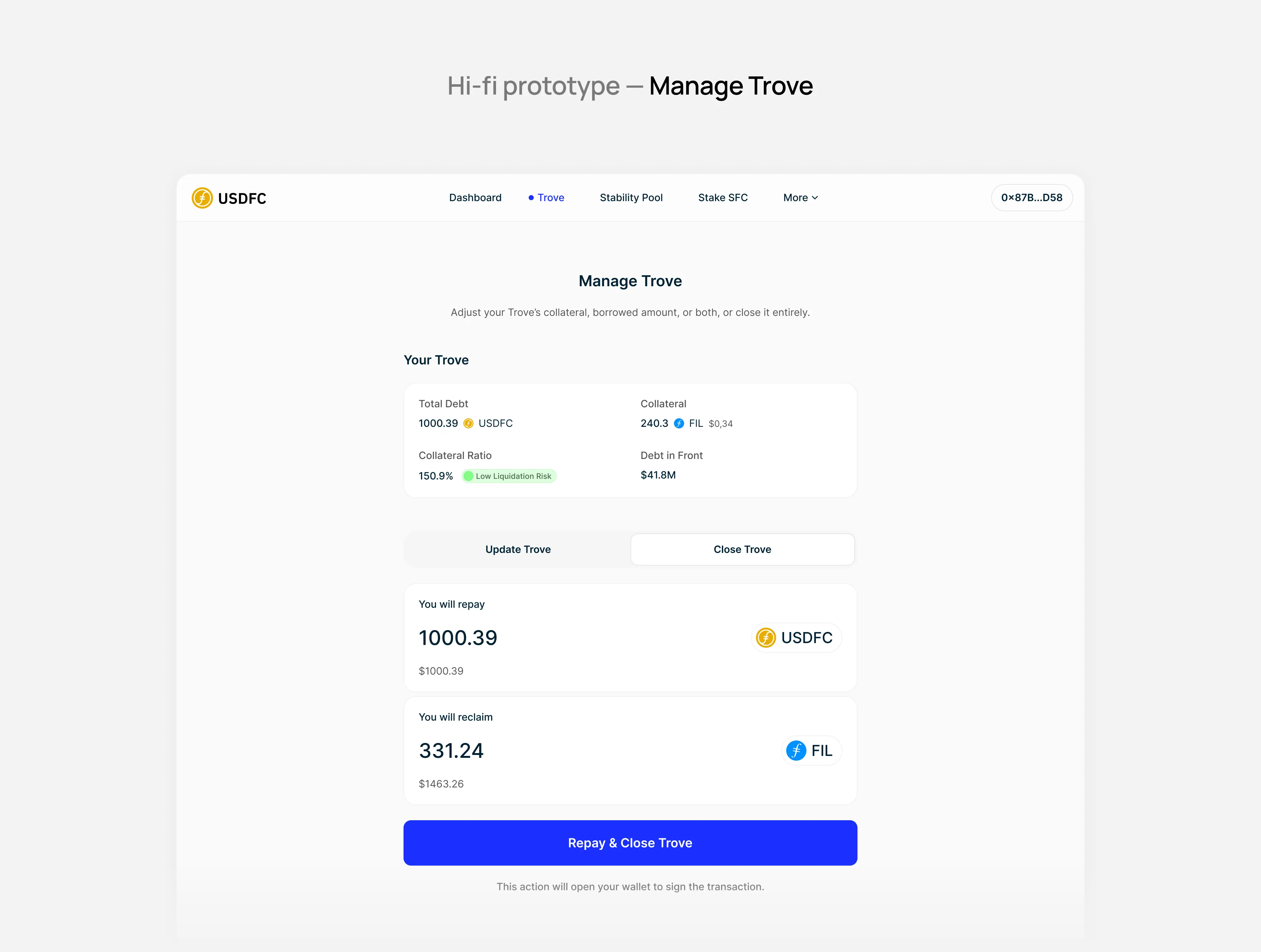
Withdrawals and trove closure issues: People encountered broken or inconsistent behavior when attempting to withdraw collateral or close troves. The interface would reset values unexpectedly, and the logic for required USDFC amounts wasn't clear, blocking key actions.
-
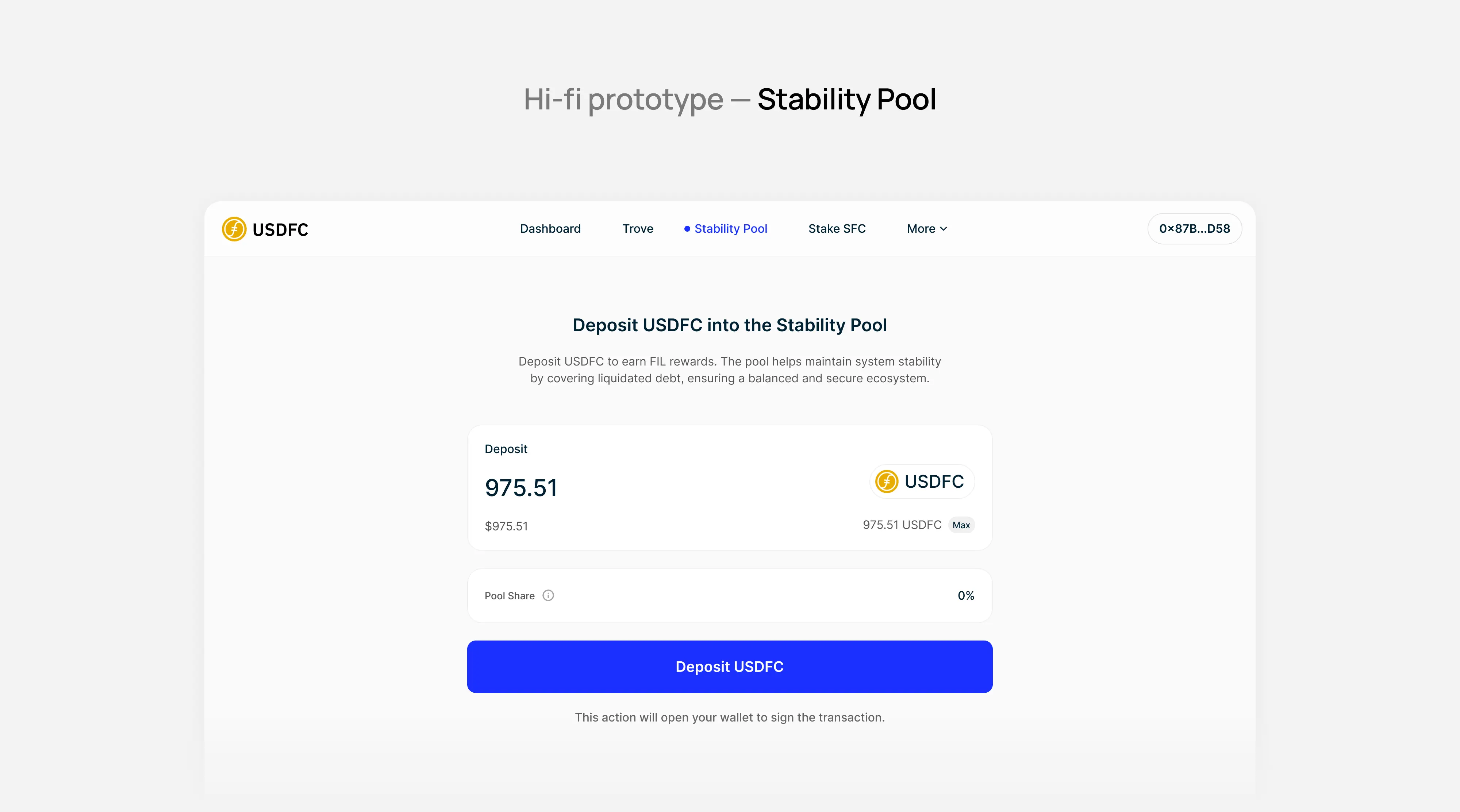
Unclear value proposition: The platform didn’t clearly explain the benefits of borrowing USDFC or participating in the stability pool, leaving participants unsure why they should engage with the protocol at all.
-
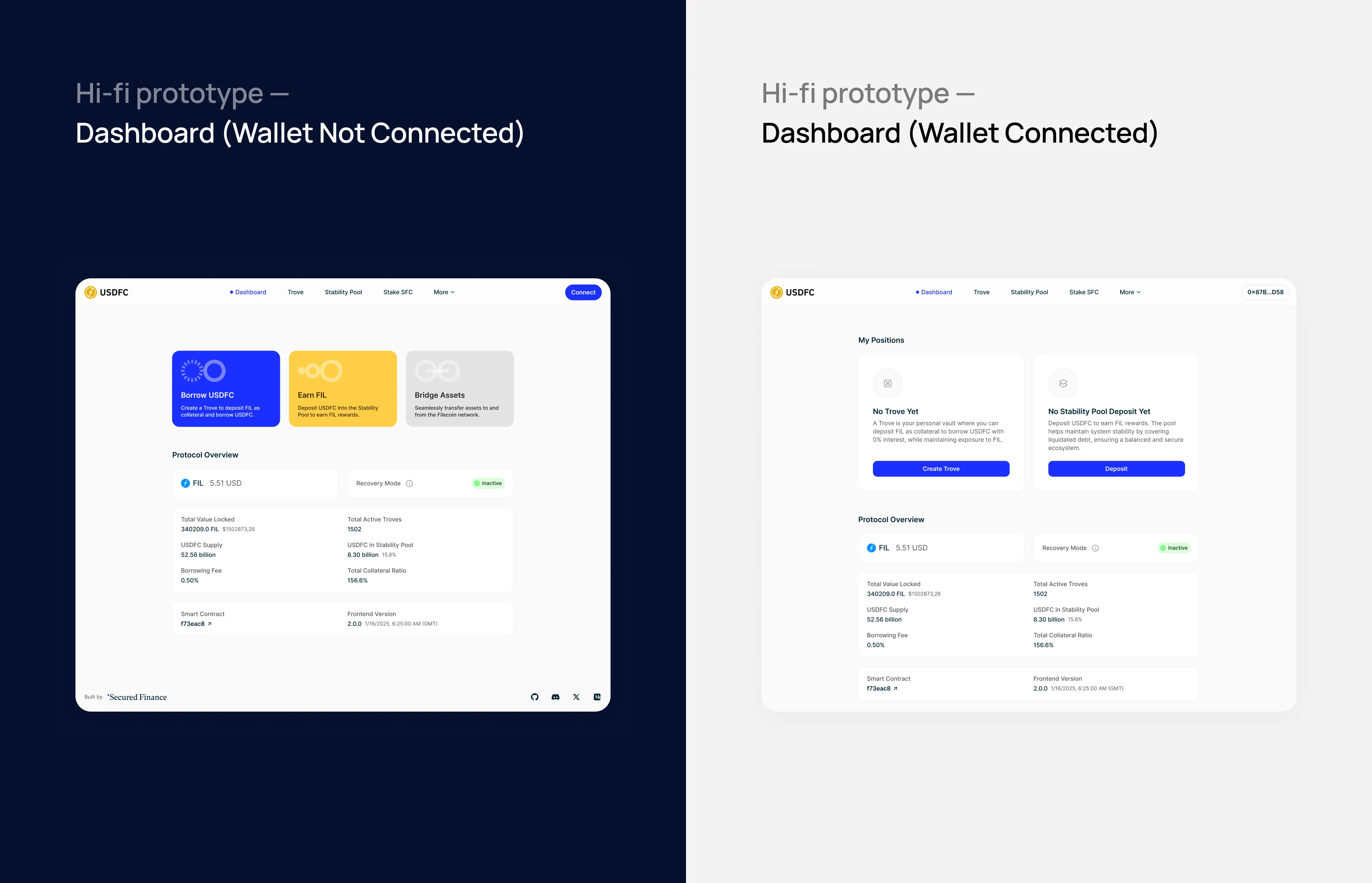
No wallet-free preview mode: Requiring wallet connection before exploring the app caused trust issues. People wanted a way to preview the interface and learn about the product without connecting their wallet.
-
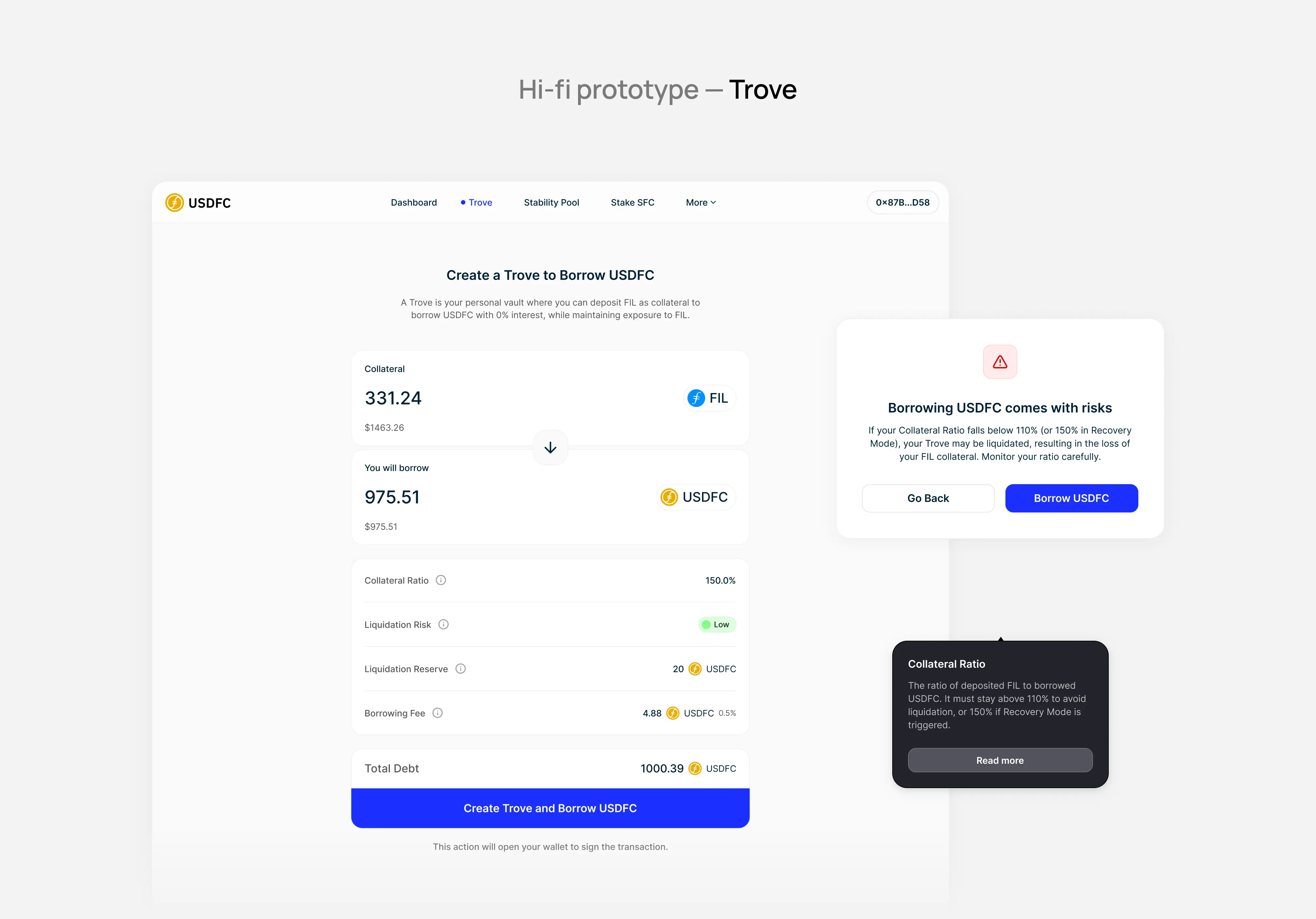
Lack of risk context: Terms like “Collateral Ratio,” “Liquidation Reserve,” and “Risky Troves” were shown without helpful context or tooltips, making it difficult to understand how the system works and what users should pay attention to.
-
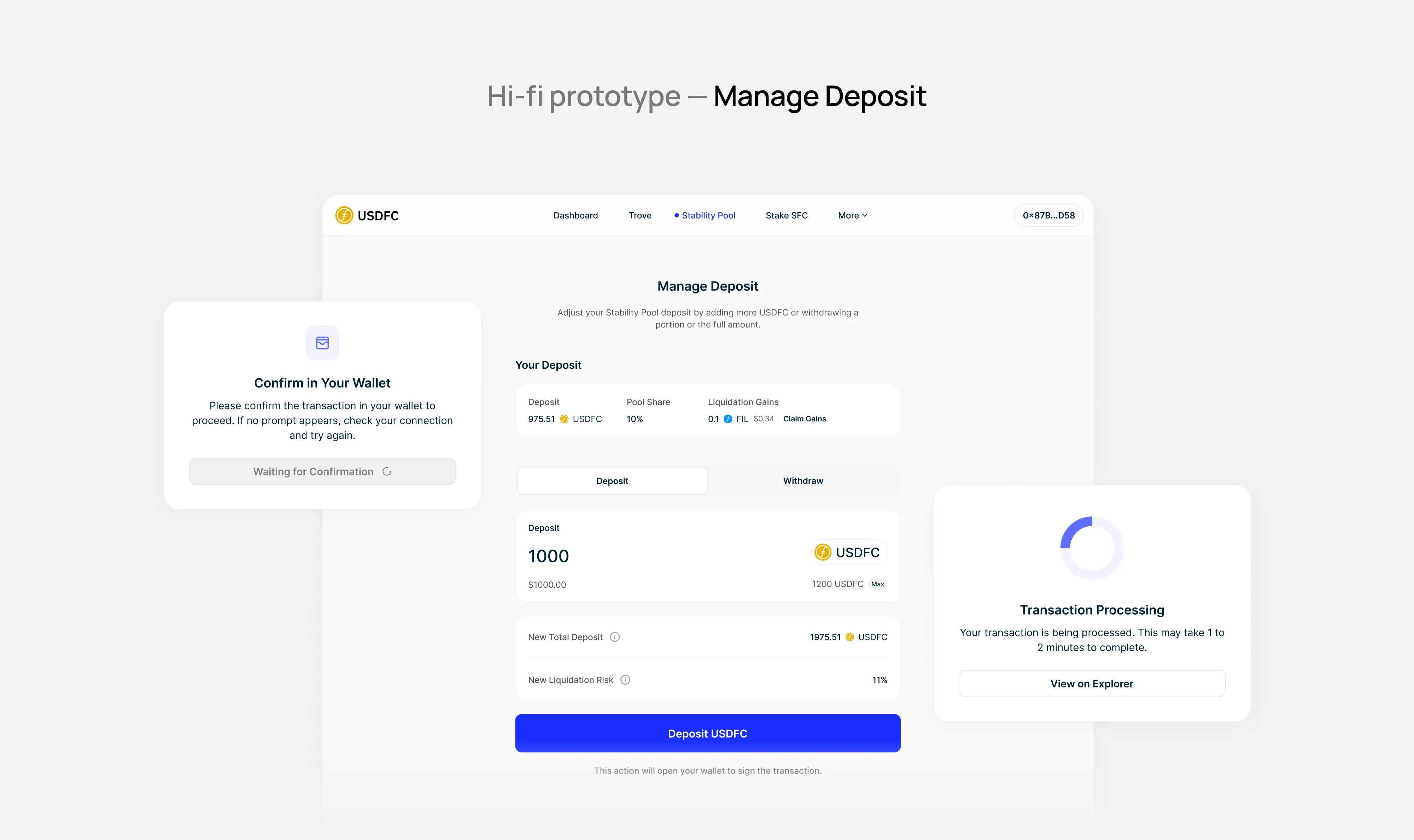
Broken or missing feedback: Actions like "Pay Now" or “Deposit” often lacked success confirmation, while slow transactions (sometimes over 2 minutes) left participants wondering if anything was happening. There were no visible reminders to confirm actions in wallets like MetaMask.
-
Accessibility and terminology gaps: Some terms like "Trove" and "Fixed Income" felt unclear or overly technical. Icons lacked tooltips, focus states were missing for keyboard users, and buttons were too small to meet accessibility standards.
These issues made the app appear unstable and unapproachable, especially for those unfamiliar with DeFi.
Goals
The redesign had several goals:
- Keep existing features (trove creation to borrow USDFC, and depositing in the stability pool);
- Redesign the interface to be cleaner, clearer, and more consistent;
- Explain key terms and risks within the app, not just in external docs;
- Improve trust and clarity by addressing broken flows, adding feedback, and better communicating what's happening behind the scenes;
- Reduce onboarding friction by allowing limited access before wallet connection;
- Build a consistent and reusable component system for future scalability;
- Make the app accessible to a wider range of people, from seasoned DeFi natives to newer participants in the Filecoin ecosystem.
Process
Using insights from the dogfooding session, I mapped updated user journeys for:
- Opening a trove and borrowing USDFC;
- Viewing and managing active troves;
- Participating in the stability pool;
- Viewing system stats and protocol health.
Each flow was annotated with pain points from the dogfooding report and layered with new UX requirements (tooltips, confirmations, success/error states).
A new component library was then created in Figma aligned with Filecoin Foundation accessibility standards. Key updates included:
- Redesigned modals, buttons, input sliders, and status indicators;
- Tooltips and icon labels for financial terms;
- Accessible focus states and minimum touch targets;
- Clear visual hierarchy to improve scannability.
The key interface copy now:
- Uses plain language for complex terms;
- Includes call-to-action prompts for each page;
- Clarifies the purpose of specific actions;
- Provides real-time feedback of what's happening (e.g. “Transaction pending, please confirm in wallet”).
Solution Highlights
-
Trove creation and management redesign: Visual improvements show collateral ratio health clearly, include action-based guidance, and add success messages when borrowing, updating or closing a position.
-
Pre-connection state: Now everyone is able to see what the app does without connecting a wallet.
-
Better feedback and progress indicators: Added loaders, wallet confirmation prompts, and visual status updates to reduce confusion during long-running operations.
-
Terminology support: Added descriptions, tooltips and simplified phrasing for terms like "Stability Pool," "Liquidation Reserve," and "Risky Troves."
-
Accessibility upgrades: All buttons now support keyboard interaction, icons are labeled, and touch targets meet WCAG standards.
Next Steps
This collaboration is still ongoing. The next steps include:
- Adding new features like supporting staking of other tokens;
- Preparing and running usability testing rounds with both new and experienced people;
- Supporting development with design QA and iteration based on feedback.